
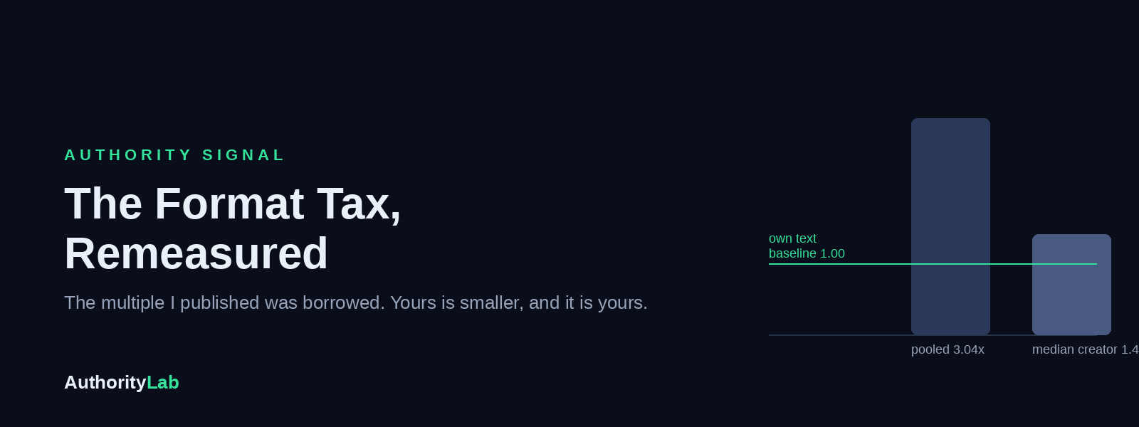
The Format Tax, Remeasured
On the afternoon of 13 August I was arguing with my own product. The report told every user that creators who post once or twice a week earn more per post than anyone heavier, and I had stopped believing it. Per post is a strange unit for a week's work, I said to nobody, and went to check whether six posts might still out-reach two even if each one landed a little softer. They did. Worse, the per-post decline was never there either. The light-week pile and the heavy-week pile were different people, and the gap between the piles was a gap between audiences wearing a lab coat.
That was a good afternoon. I had caught an error, written the correction and felt the particular glow of a man who has been rigorous. Then I wrote the rule down, because a rule you only apply to the finding you already dislike is a mood. The rule: if a comparison sorts posts by anything that correlates with who wrote them, run it inside each creator before you publish it. Then I did the thing you are supposed to do with a rule, which is run it against everything else on the shelf.
The shelf held The Format Tax. It was my favourite article. In May I had told readers that the best-written post on LinkedIn was a text-only post, that I had believed it too, that I had checked, and that images beat text by a wide, clean, almost embarrassing margin. I told them to add an image to their next three posts. I told them the ratio transferred to them whatever their size. I had said it at dinner. I had said it in DMs. (I had, in the honest sense of the word, believed it.) It took the rule one pass to break it.
What I published, and the sentence that gave it away
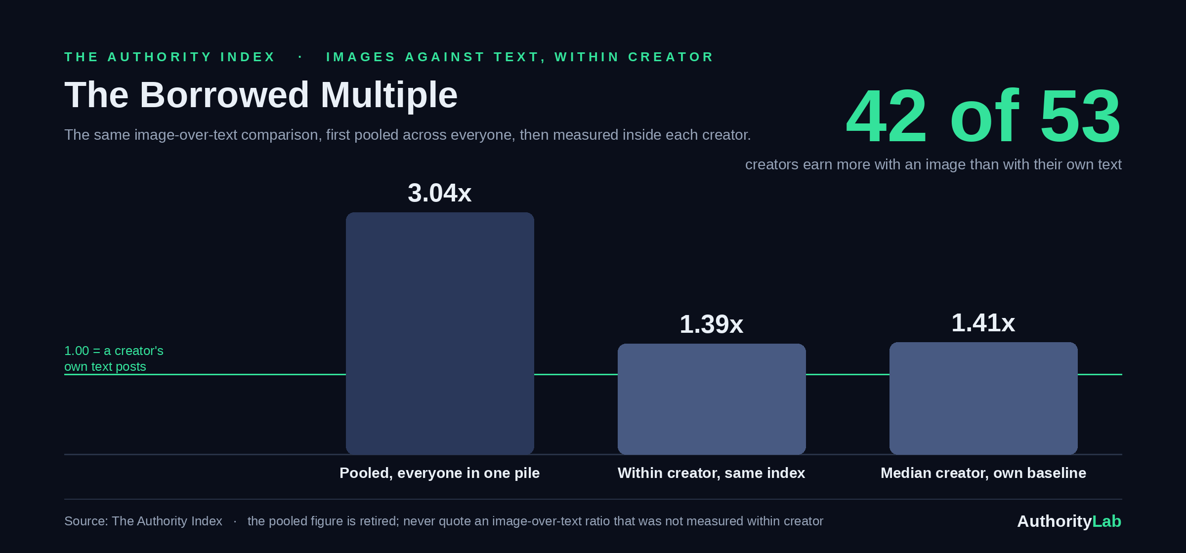
The May article pooled every image post in the Index into one pile and every text post into another, averaged each pile, and divided. Image posts came out at 2.5 times text. The report that fed the product ran a fresher cut of the same comparison and got 3.04x. Both were the same arithmetic, and the article carries a sentence about that arithmetic which now reads like a confession: "Same creators. Same audiences. The only thing that changed is whether there was an image attached."
Every word of that is wrong, and it is wrong in the same way the cadence claim was wrong. The image pile and the text pile are not the same creators in the same proportions. Some people in the Index attach an image to almost everything. Some almost never do. If the first group happens to have the bigger audiences, the image pile inherits those audiences, and the multiple you get by dividing one pile by the other is partly a multiple of followers, borrowed from other people. It will never transfer to you, however good your picture is. Call it the borrowed multiple. I published one with a straight face and a caveat box.
The same measurement, run one person at a time
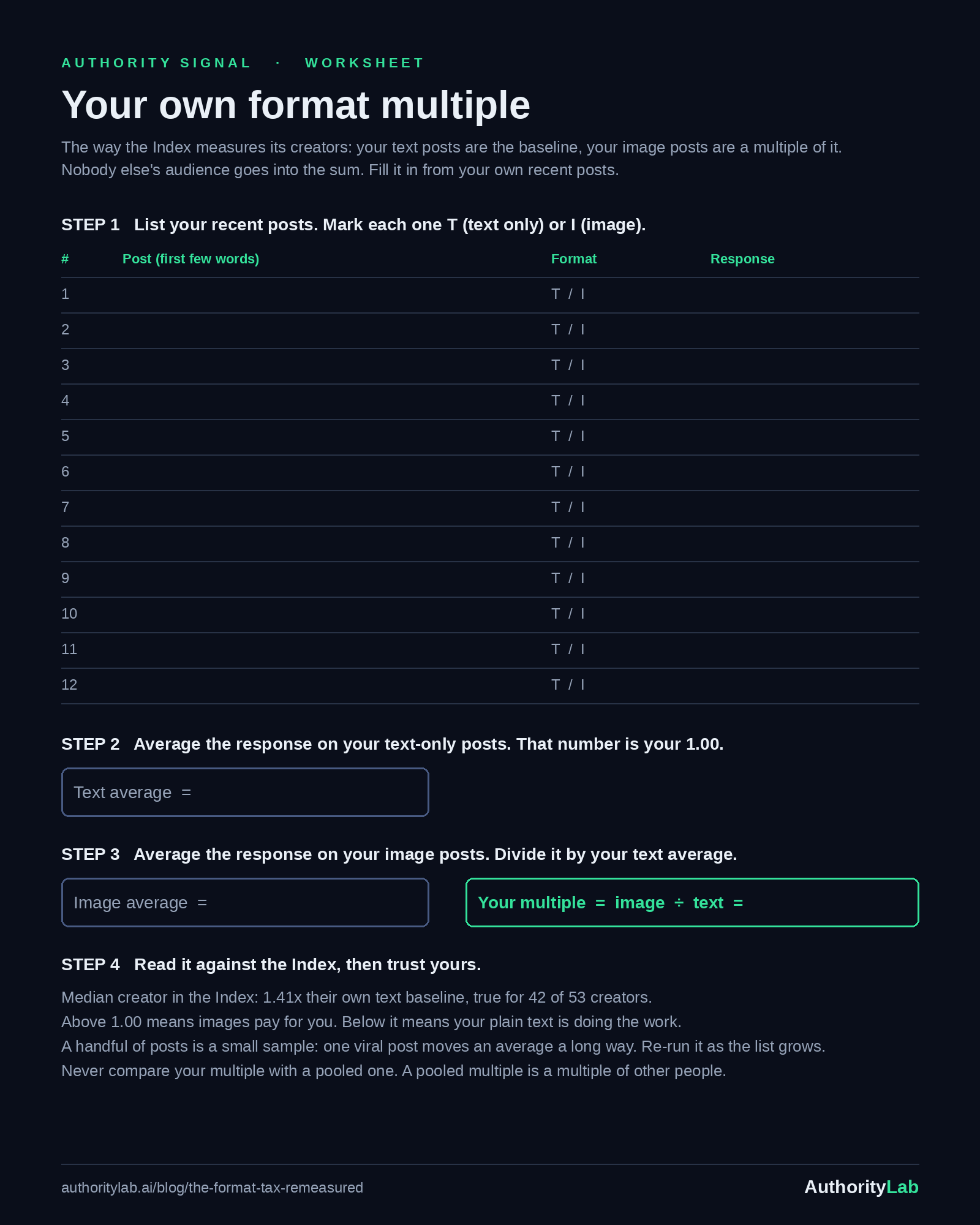
The honest cut is simple to say and slightly tedious to run. Take one creator. Average their text-only posts: that is their baseline, call it 1.00. Average their image posts and express it as a multiple of that baseline. Do this for every creator, then look at the spread of multiples. Nobody's audience can flatter anybody else's number, because nobody is ever compared with anybody else. A creator with a huge following and a creator with a small one each get one figure, and it is the same kind of figure.
Run that way, the pooled 3.04x becomes 1.39x on the same index. Creator by creator, the median creator earns 1.41 times their own text baseline when they attach an image, and it holds for 42 of 53. I want to be careful here in both directions. That is a real effect, for most of the people we measured, and it is worth having. It is also well under half the multiple I sold you in May, and the part of that multiple that could ever have transferred to you was the smaller part all along.
The caveat that knew
Here is the part I find almost funny. After the re-run I went back and read the May article properly, the way a reader would, all the way to the bottom. The last section is a caveat box. It says, in my own words, that averages get pulled around by big accounts, that a creator-relative view tells the same story with a gentler slope, and that the exact multiple should be taken as directional. I had written the correction. I had written it in May. I had put it in a grey box under a headline that said "half your reach" and a paragraph telling you the ratio was universal, and then I had moved on to the next article.
That is what a caveat is for, if you are not careful: it lets the writer feel honest while the headline does the work. I do not think I was lying. I think I held two beliefs at once, one in the headline and one in the box, and I let the reader carry the contradiction because it was easier than resolving it myself. The within-creator run resolved it. The box was right and the headline was wrong, and the only thing the box lacked was the number that would have made it the headline.
What actually changes for a writer
Less than you might fear and more than nothing. Images still pay, for most people, against their own norm. The advice to put a designed visual on a post that carries an argument stands. What falls is everything I built on the size of the gap. The line about the ratio transferring to you at any audience size was a claim I had no way to test, because the pooled cut never looked at any one creator, let alone a small one. The claim that no intent existed where text beat image was the same pooled cut sliced by intent, and every slice inherits the same borrowed audiences. And the instruction to lead with images on your Inspire and Provoke posts, where the gap looked widest, was reading a gap that was mostly people.
There is one more figure worth carrying, because it puts format in its place. When we fitted a model on the seven things that predict a post's response, format got 8 points of 100, the smallest weight of the seven. Point of view got 30. An image is the cheapest lever to pull, which is why it is tempting to write about, and the lightest one, which is why I should have written about it more carefully.
What I do differently now
Every band comparison in the Index now runs within creator before it is allowed anywhere near a reader, and the rule sits in the one file every article draws its numbers from. I have stopped telling anyone what an image is worth in general, because "in general" was the whole error. When someone asks, I give them the median creator's multiple, the count it holds for, and then I ask what their own recent posts say. (Most people have not looked. Neither had I, and I run the Index.)
The universal version is short. A number that compares two groups of people is a number about people. Before you build a habit on it, ask whether the same person, doing both things, shows the same gap. If the answer comes back smaller, the smaller answer is the one that belongs to you.
See where you stand. The free Authority Lab audit scores your writing and your profile against the Index and shows you which lever is costing you the most points.
Want it pulled apart with you? Book a 30-minute Authority Consult and we'll run your profile against the data, live.
Every figure here is one cut from the Authority Index: 29,599 classified LinkedIn posts from 53 creators.