The Format Tax: Why Text-Only Posts Cost You Half Your Reach
The best-written post on LinkedIn is a text-only post. That is the received wisdom. Just you, a strong hook, and a wall of well-crafted words. No "gimmicks." Real thought leadership does not need a picture. I believed it too. Then I checked.
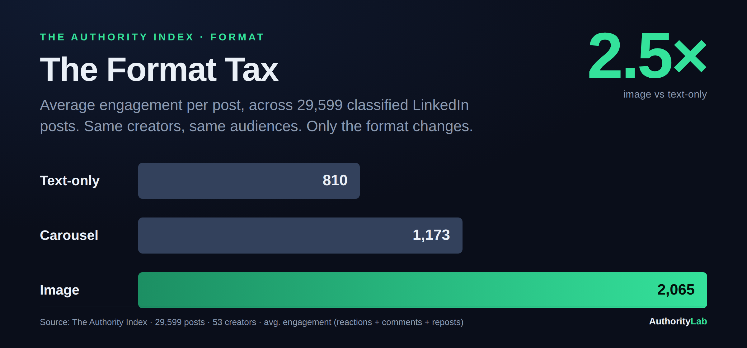
We classify every post in the Authority Index across 100+ fields, and one of them is format: text, image, or carousel. So I pulled the average engagement for each. (Engagement, if you are new to the term, just means the total visible response a post gets: reactions, comments and reposts added up.)
Text-only posts average 810 engagement. Image posts average 2,065. That is a 2.5x gap. Same creators. Same audiences. The only thing that changed is whether there was an image attached.
The number people do not want to be true
The gap holds across intent (what a post is trying to do, whether that is teaching, inspiring, or selling). I checked every category. There is no intent where text-only meaningfully beats image. Not one. The format advantage is close to universal.
What it looks like in the wild
You can see the pattern in the Index's top image posts. Here is one, embedded live from LinkedIn. Notice the shape: a single strong idea, one striking image, no plea for engagement.
What to do with this
Add an image to your next three text posts. Not a stock photo, not a headshot. A designed visual that makes the core argument visible. Start with your Inspire and Provoke posts, where the gap is widest (more in Inspire Is Underpriced). And stop treating carousels as the default upgrade: they are a specialist tool, not a better version of a post.
The caveat
This is average engagement, and averages get pulled around by big accounts. A creator-relative view tells the same story with a gentler slope: image is additive at every audience size, just not always by 2.5x. Take the exact multiple as directional. The direction is not in doubt. The format tax is the easiest one to stop paying. You already wrote the hard part.
See where you stand. The 2-minute Authority Diagnostic benchmarks your content against all 29,599 posts in the Index and tells you which gap is costing you most.
Want it pulled apart with you? Book a 30-minute Authority Consult and we'll run your profile against the data, live.
Every figure here is one cut from the Authority Index: 29,599 classified LinkedIn posts from 53 creators.